Confused by print jargon like CMYK and Pantone? Worried your packaging colors won't match your brand vision? Getting inconsistent colors can hurt your brand's look.
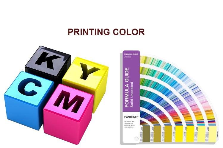
CMYK uses four inks (Cyan, Magenta, Yellow, Black) mixed as dots to create many colors, best for photos. Pantone (PMS) uses pre-mixed solid inks ("spot colors") for exact color matching, perfect for logos and brand consistency.
Understanding this basic difference is key, but choosing the right system for your custom packaging involves more detail. Let's explore how each system works and when to use it.
What Exactly is CMYK Printing?
See "CMYK" on quotes but unsure what it means for your boxes? Worry that the final color might not look right? Misunderstanding CMYK can lead to print results you didn't expect.
CMYK stands for Cyan, Magenta, Yellow, and Key (which is Black). It's called "4-color process printing." Tiny dots of these four inks are printed close together to trick your eyes into seeing a full spectrum of colors.

Think of how old newspaper comics used dots. CMYK printing works similarly but with much smaller, more precise dots called halftones1. It's the standard method used in most home and office printers, and also widely used in commercial printing for things like magazines, brochures, and much of the packaging we produce at Finer-Packaging.
How CMYK Creates Color
Imagine you want to print an orange color. The printer doesn't use orange ink. Instead, it prints tiny dots of Magenta (pinkish-red) and Yellow inks very close together. When you look at it, your brain blends these dots, and you see orange. By varying the size and spacing of the dots for each of the four CMYK inks, a huge range of colors can be simulated2. Black (Key) ink is used to add depth, shading, and for printing true black text.
Advantages of CMYK
The main advantage of CMYK is its ability to reproduce complex images with many colors, tones, and gradients relatively easily and cost-effectively in a single pass through the printing press (after the initial setup).
- Good for Photographs: It's the best way to print photos or realistic illustrations on your packaging.
- Cost-Effective for Multi-Color Designs: If your design has lots of different colors blended together, CMYK avoids the need for multiple expensive custom inks3.
- Standardization: It's a widely understood and used process globally.
Limitations of CMYK
However, CMYK has limitations:
- Color Gamut: The range of colors CMYK can reproduce is smaller than what you see on your computer screen (which uses RGB - Red, Green, Blue light) and smaller than the Pantone system for certain colors. Very bright, vibrant colors (like fluorescents or some oranges and greens) can look duller4 when printed in CMYK.
- Color Consistency: Because colors are mixed using dots, slight variations can occur between different print runs, or even between different printers using the same files. Factors like paper type, humidity, and machine calibration can affect the final look. [Placeholder for personal story: I remember a client who was very particular about their blue. We printed CMYK samples on different paper stocks to show how the color could shift slightly, helping them understand why Pantone might be better for critical brand colors.]
- Solid Color Appearance: Large areas of flat, solid color printed in CMYK can sometimes look subtly textured or less intense compared5 to a solid spot ink.
At Finer-Packaging, we use calibrated equipment and proofing processes to manage CMYK color accuracy for our clients in North America and Europe, but it's important to understand these built-in characteristics.
| Feature | CMYK Printing |
|---|---|
| Color Creation | Mixing dots of Cyan, Magenta, Yellow, Black |
| Best Use | Photos, complex multi-color images, gradients |
| Consistency | Can have slight variations run-to-run |
| Color Range | Wide, but limited for certain brights/neons |
| Cost | Generally cost-effective for full-color |
How is Pantone (PMS) Different?
Need your brand color to be the exact same shade every single time, on every box? Worried CMYK just won't be precise enough? Inconsistent brand colors can weaken your identity.
Pantone Matching System (PMS)6 uses specific, pre-mixed inks called "spot colors." Each color has a unique reference number (e.g., PANTONE 185 C for a specific red). This ensures perfect color consistency across different print jobs and materials.
Unlike CMYK which mixes colors on the fly using dots, Pantone works like buying a specific can of paint that's already mixed to a precise formula at the factory. Printers use this specific ink formulation, identified by its PMS number, guaranteeing the color is the same every time it's printed, anywhere in the world. This is why we call them "spot colors" – you're laying down a spot of that single, specific ink.
The Spot Color Concept
Think about Coca-Cola Red or Tiffany Blue. These iconic brands rely on their specific colors being instantly recognizable and absolutely consistent. They achieve this using Pantone spot colors. When you choose a Pantone color, say from the standard Formula Guide swatch book (which shows colors on Coated 'C' and Uncoated 'U' paper), you are choosing a universally defined ink recipe. We, as the packaging manufacturer, either order that specific pre-mixed ink or mix it ourselves according to the official Pantone formula to ensure accuracy.
Why Use Pantone?
The primary reasons brands choose Pantone colors are:
- Unmatched Consistency: This is the biggest advantage. If your logo needs to be PANTONE 286 C (a specific blue), using that spot ink ensures it looks exactly like PANTONE 286 C whether it's printed on a business card, a brochure, or the custom boxes we make for you here in China. CMYK can only approximate most Pantone colors.
- Wider Color Range: The Pantone system includes many vibrant colors, metallics (like silver and gold), and neons that simply cannot be reproduced accurately using the CMYK dot mixing process. If your brand relies on one of these special colors, Pantone is often the only way to print it correctly.
- Solid Color Vibrancy: Large areas printed with a solid Pantone spot ink often look smoother, more uniform, and more vibrant than the same color simulated using CMYK dots.
Cost Considerations
Using Pantone colors usually adds cost compared to a standard CMYK print job. Each spot color requires its own printing plate and a separate unit on the printing press.
- 1-Color or 2-Color Jobs: If your design only uses one or two specific colors (like just your logo and text in black on a white box), printing with just those Pantone spot colors can sometimes be more cost-effective than setting up for CMYK.
- Adding to CMYK: If you have a full-color CMYK design (like a photo) but also need your logo to be perfectly color-matched, you might print using CMYK plus one or more Pantone spot colors. This is often called a "5-color" or "6-color" job7 (CMYK = 4 colors, +1 PMS = 5 colors) and adds cost for each additional spot color.
As a B2B wholesale supplier, we always discuss these cost implications with our clients. Our MOQ of 500-1000 pieces allows for cost-effective high-quality printing, but adding multiple spot colors will increase the unit price.
| Feature | Pantone (PMS) Printing | CMYK Printing (for comparison) |
|---|---|---|
| Color Creation | Specific pre-mixed solid ink (Spot Color) | Mixing dots of C, M, Y, K (Process Color) |
| Best Use | Logos, brand colors, specific shades, metallics | Photos, complex multi-color images, gradients |
| Consistency | Extremely high, standardized globally | Can have slight variations run-to-run |
| Color Range | Very wide, includes special inks (metallic) | Wide, but limited for certain brights/neons |
| Cost | Adds cost per spot color (usually) | Generally cost-effective for full-color |
When Should I Use CMYK vs. Pantone for My Packaging?
Still scratching your head about which system fits your project? Dealing with budget limits but wanting quality? Choosing incorrectly can lead to print results you don't love or costs you didn't expect.
Use CMYK for packaging with photos, complex illustrations, or many colors/gradients. Use Pantone for critical brand colors (like logos), large solid color areas needing perfect consistency, or specific colors CMYK can't hit. Often, using both together is the best solution.

Making the right choice depends heavily on your specific design, your brand identity requirements, and your budget. At Finer-Packaging, manufacturing custom packaging for diverse clients – from startups to established brands exporting to North America and Europe – means we help navigate this decision daily. Here’s a practical breakdown:
Decision Factors: Design Complexity
- Photographic Images or Complex Illustrations: If your packaging features photos of your product, lifestyle imagery, or detailed illustrations with lots of colors and smooth transitions (gradients), CMYK is almost always the primary choice. It's designed for this kind of work. Trying to reproduce a photo using only a few spot colors would look posterized and unrealistic.
- Simple Graphics, Text, Logos: If your design is simpler, perhaps just your logo, product name, and some text on a colored background, you have more options. You could use CMYK, but if the specific color of the logo or background is critical for your brand, using Pantone spot colors will give you much better consistency.
Decision Factors: Brand Identity
- Critical Brand Colors: Does your brand have one or two specific colors defined in your style guide (e.g., "Our brand blue is always PANTONE 300 C")? If yes, using that Pantone spot color for your logo and other key brand elements is highly recommended, even if the rest of the design uses CMYK. This ensures brand recognition and consistency across all your materials.
- Luxury or Premium Feel: For high-end products, the perceived quality of the packaging is crucial. Using Pantone spot colors, especially metallics or specific rich, deep shades, can contribute to a more premium look and feel due to their solidity and vibrancy compared to CMYK simulations.
Decision Factors: Budget
- Cost Sensitivity: CMYK (4-color process) is often the baseline cost for full-color printing. Every Pantone spot color you add usually increases the cost because it requires an extra printing plate and setup on the press. If the budget is very tight, sticking to CMYK only might be necessary, but requires careful proofing to ensure the simulated brand colors are acceptable.
- Volume: For very large print runs (well beyond our typical 1000pc cost-effective point), the per-piece cost difference might become smaller, potentially making Pantone additions more feasible.
Combining CMYK and Pantone
Often, the best approach for complex packaging is to use both systems together. A common scenario:
- Print the photographic elements and general background graphics using CMYK.
- Add one or two Pantone spot colors for the company logo and perhaps a critical background color block or headline text.
This gives you the richness of CMYK for images and the guaranteed accuracy of Pantone for your core brand identity elements. It's a balance between capability, consistency, and cost. [Placeholder: Share an example of a Finer-Packaging client who successfully used a 5-color (CMYK + 1 PMS) approach for their product packaging.]
It’s also vital to remember that colors on your computer screen are RGB (Red, Green, Blue light) and will never perfectly match printed colors (CMYK inks or PMS inks) without proper calibration and conversion. Always rely on physical proofs or Pantone swatch books for final color approval8, not just your screen display. Our Pre-production Samples are ideal for this final check.
| Scenario | Recommended Approach | Reasoning |
|---|---|---|
| Box with product photo & complex graphics | Primarily CMYK | Best for image reproduction, cost-effective for many colors |
| Box with photo + critical logo color | CMYK + 1 Pantone Spot Color | Balances image quality with essential brand color consistency |
| Simple box: Logo + Text on solid color | 1 or 2 Pantone Spot Colors | Ensures perfect color consistency, potentially cost-effective |
| Budget-focused multi-color design | CMYK only | Manages cost, requires careful proofing for color accuracy |
| Design needing Metallic Silver/Gold | CMYK + Pantone Metallic Spot | CMYK cannot reproduce true metallics; Pantone spot ink required |
Understanding these differences helps you have informed discussions with us, your packaging manufacturer, to ensure your vision comes to life accurately and effectively within your budget. Our typical production time of 10-15 business days starts after you approve the final proof or sample.
Conclusion
CMYK mixes four inks for photos and complex designs. Pantone uses specific pre-mixed inks for perfect color consistency, vital for brands. Choose based on your design, brand needs, and budget.
Learn exactly what halftone dots are and how they are used to reproduce tones and images in print media. ↩
Understand the spectrum and limitations of colors that can be created using the standard four-color process. ↩
Understand when CMYK printing is more budget-friendly compared to using specific pre-mixed (spot) inks. ↩
Understand why the colors you see on screen (RGB) often cannot be perfectly matched in CMYK printing. ↩
See why large flat areas printed with CMYK dots can look different than using a pre-mixed spot ink. ↩
Understand the definition of Pantone PMS and spot colors, the standard for precise, consistent color matching.
 ↩
↩Learn the terminology and process for print jobs combining standard CMYK with additional Pantone spot colors. ↩
Discover why physical proofs (like samples or swatch books) are essential for accurate color decisions, unlike screen previews. ↩