You have a fantastic formula and high-quality ingredients, but sales are flat. You priced your product as "luxury," yet customers aren't buying it. It’s frustrating when you know the product inside is gold, but it stays stuck on the shelf.
The culprit is often the packaging. If your box feels cheap, looks generic, or offers a frustrating unboxing experience, customers cannot justify the premium price tag. Your packaging must signal value through tactile materials, clear messaging, and a design that connects emotionally.
It is harsh but true: in the beauty industry, the box sells the product first. If the outside doesn't match the promise of the inside, trust is broken immediately. Let’s explore the specific packaging reasons why your skincare brand might be struggling.
Does Your Packaging Physically Feel Like a Luxury Product?
Do customers pick up your box and immediately put it back down? Is there a disconnect between your $80 price tag and the flimsy cardboard in their hands? This sensory gap is a sales killer.
Luxury is tactile. If your packaging materials feel light or flimsy, lack texture, or use colors that evoke "discount" rather than "premium," customers perceive low value. High-quality finishes like soft-touch lamination, embossing, and substantial weight are crucial for convincing buyers to pay more.

As a manufacturer, I see many brands make the mistake of spending 95% of their budget on the bottle and cream, and then pinching pennies on the outer box. This is a fatal error for premium skincare. When a customer shops for luxury beauty, they aren't just buying a lotion; they are buying an experience of self-care and indulgence. The physical touch of the box is the first handshake of that experience.
The Weight of Quality
There is a psychological connection between weight and value. We naturally associate heavier items with higher quality and durability. If your premium night cream comes in a thin, standard folding carton (like a toothpaste box), it subconsciously screams "drugstore" to the consumer. For premium lines, we often recommend rigid boxes (also known as set-up boxes) or high-caliper folding cartons. A rigid box doesn't bend when you squeeze it; it feels solid and permanent. I remember a client who switched from a thin 300gsm carton to a 1200gsm rigid box for their serum. Even without changing the graphic design, their sales jumped because the product finally "felt" expensive.
The Power of Texture
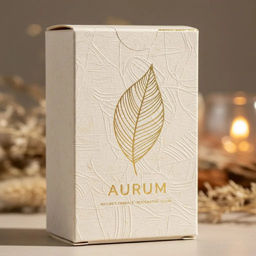
Smooth, glossy cardboard is the standard for mass-market products. To stand out as premium, you need to engage the sense of touch. Using textured paper—like linen stock or uncoated kraft—can immediately differentiate your brand. Special finishes are equally important.
- Soft-Touch Lamination: This gives the box a velvety, skin-like feel that is incredibly popular in skincare.
- Embossing/Debossing: Raising or lowering your logo creates a 3D effect that fingers want to explore.
- Spot UV: Creating contrast between matte and shiny areas draws the eye and feels sophisticated.
Color Sends a Signal
Color psychology is real. While bright neons might work for a teenage acne brand, they rarely signal "premium anti-aging." Luxury often leans towards deep, rich tones (navy, emerald, burgundy), minimalist black and white, or muted pastels and metallics. If your color palette is too loud or chaotic, it might be evoking the wrong emotions—cheapness or urgency—rather than the calm, exclusive feeling of luxury skincare.
| Feature | "Cheap" Perception | "Premium" Perception |
|---|---|---|
| Material | Flimsy, bends easily | Sturdy, rigid, substantial weight |
| Finish | Standard high gloss | Soft-touch matte, textured paper |
| Design | Flat print only | Embossing, foil stamping, spot UV |
| Colors | Neon, chaotic mix | Muted, metallic, monochrome |
Is Your Design Blending In Instead of Standing Out?
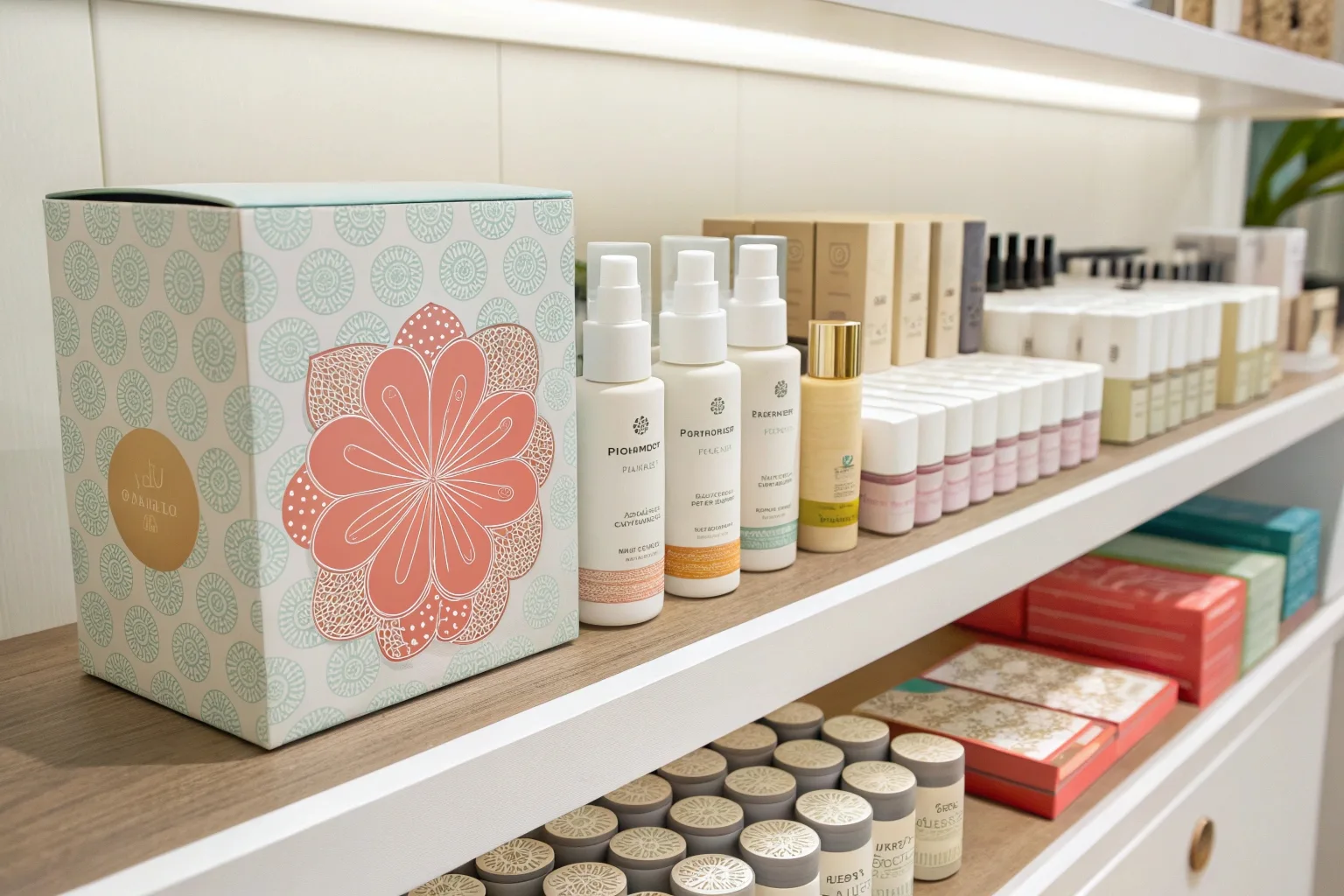
Does your product look just like every other bottle on the shelf? Are you relying on the same white box and black text as everyone else? Being generic is a fast track to being ignored.
A generic design gets lost in a crowded market. Premium packaging needs to clearly communicate unique benefits and tell a compelling brand story to create an emotional connection. Without a unique identity, customers have no reason to choose you over a cheaper competitor.

The skincare market is oversaturated. If your packaging doesn't have a distinct point of view, it becomes invisible. I’ve seen brands try to copy the "minimalist" look of successful giants, but without the brand recognition, it just looks unfinished or plain.
The Curse of Being Generic
If I put your box next to a generic store-brand product, can the customer tell the difference? If the answer is no, you have a problem. "Clean and simple" is a popular trend, but it can easily veer into "boring and forgettable." Your design needs a hook—a unique pattern, a distinct structural shape, or a bold use of typography that commands attention. It’s not just about looking good; it’s about looking different.
Clarity is King
While the design needs to be beautiful, it also needs to work. Premium products often fail because they are too vague. A customer willing to spend $100 on a cream wants to know why it costs that much. Does your box clearly highlight the active ingredients (like Retinol or Hyaluronic Acid)? Does it explain the specific benefit (e.g., "Plumps skin in 24 hours")? If the messaging is hidden in tiny text or obscured by artistic graphics, the customer won't do the work to figure it out. They will just buy the competitor who explains it clearly.
Selling a Feeling (Brand Story)
People buy premium products to become a better version of themselves. Your packaging needs to sell that dream. This is your "Brand Story." It’s not just a logo; it’s the vibe.
- The Emotional Connection: Does the packaging feel clinical and scientific (trustworthy)? Or does it feel botanical and earthy (natural)?
- The Narrative: Use the back of the box or an insert to tell a short story about the sourcing of ingredients or the founder's mission.
This connection turns a transaction into a relationship. Without it, you are just selling expensive soap.
| Element | Generic / Failing | Distinct / Selling |
|---|---|---|
| Shape | Standard square box | Custom shape or unique opening |
| Messaging | Vague claims ("Good for skin") | Specific benefits ("Restores barrier") |
| Story | Just a logo | Founder story or ingredient origin |
| Differentiation | Copies market leaders | Owns a unique visual niche |
Does the Unboxing Experience Wow or Disappoint?
Does the sale end when the customer pays, or does it continue when they get home? Is your box hard to open, ripping the flap in the process? A frustrating unboxing kills the luxury vibe.
An underwhelming or difficult-to-open box ruins the premium feel. Packaging must be functional and "Instagrammable" to generate user content. If the unboxing isn't an event in itself, you are missing out on free marketing and repeat customers.

In the age of social media, the "unboxing" is a product feature. If your customer struggles to peel off a sticker or rips the box trying to open it, that moment of excitement turns into annoyance. For premium brands, the packaging isn't trash; it's part of the presentation.
The First Five Seconds
We talk a lot about "shelf appeal," but "hand appeal" matters just as much. Structural design is critical here.
- The "Swoosh": For rigid boxes, we engineer the fit between the lid and the base so that the lid slides off slowly—often called the "swoosh" effect (think iPhone boxes). It builds anticipation.
- Ease of Access: Customers shouldn't need a knife to open a face cream. Avoid excessive glue dots or complicated tabs.
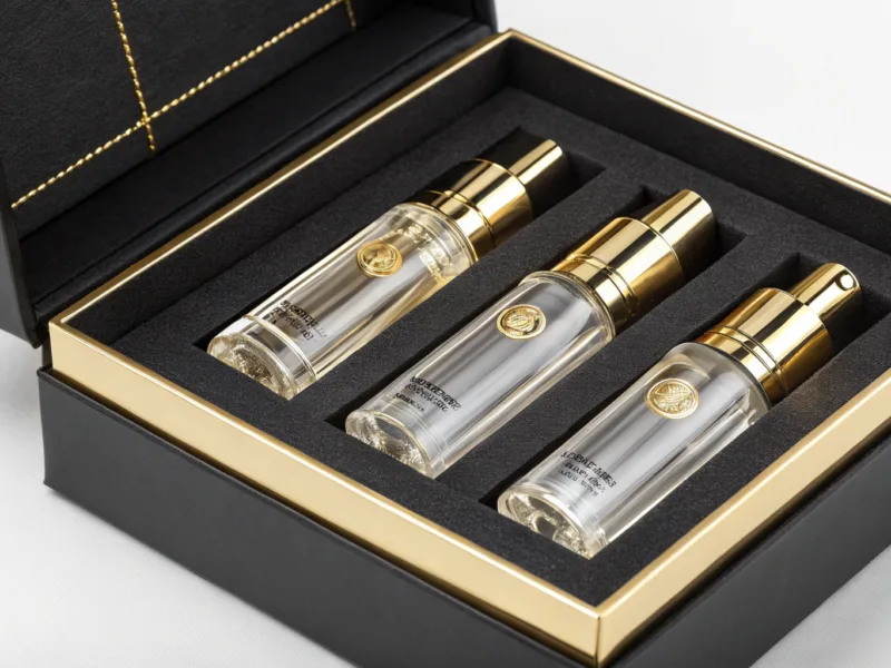
- Internal Presentation: When the box is open, does the product sit proudly in a custom insert? Or is it rattling around loose? A custom insert (made of card or high-density foam) not only protects the glass bottle but frames it like a jewel.
Social Currency (Instagrammability)
User-Generated Content (UGC) is the best marketing you can get. If your packaging is beautiful, customers will post it on Instagram or TikTok. If it’s boring, they won't.
- The "Hero Shot": Is there a specific angle where the box looks amazing?
- Inside Printing: Printing a message or pattern on the inside of the box adds a surprise element that looks great in photos.
- Personal Touches: Including a simple card or having a unique opening mechanism encourages filming.
If your packaging isn't photogenic, you are cutting off a major source of organic growth.
Functionality Matters
Beyond beauty, the box must work. If a customer travels, can they put the bottle back in the box to protect it? If the box falls apart immediately, it feels disposable. A sturdy, reusable box stays in the customer's bathroom (and mind) much longer. I worked with a brand that designed their skincare box to double as a jewelry tray. Customers loved it and kept the brand logo on their vanity for months.
Are You Misunderstanding Your Target Audience's Values?
Do you think "luxury" just means "gold foil"? Have you noticed that your target customer might care more about the planet than the bling? Ignoring values alienates buyers.
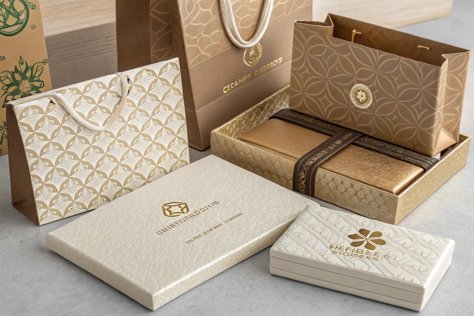
Modern luxury buyers expect eco-friendly elements. If your design doesn't align with their aesthetic expectations or lacks sustainable features ("eco-luxe"), you will lose them. A lack of sustainability is often a dealbreaker for today's premium shopper.

The definition of "premium" has shifted. Ten years ago, heavy plastic and excessive wrapping meant luxury. Today, that often looks wasteful and tone-deaf. If you are targeting a younger, affluent demographic, they are likely educated and environmentally conscious.
Defining Modern Luxury
"Eco-luxe" is the new standard. Your customer wants to feel pampered, but not at the expense of the planet.
- The Disconnect: If your brand claims to be "clean beauty" or "natural," but you use a box coated in non-recyclable plastic lamination with a giant foam insert, the customer spots the hypocrisy immediately.
- The Expectation: They expect the outside to match the ethics of the inside.
The Eco-Luxe Demand
You don't have to sacrifice beauty for sustainability. In fact, sustainable materials often feel more premium now.
- FSC-Certified Paper: Using paper from responsibly managed forests is a baseline requirement.
- Minimalism: Reducing waste (right-sizing the box so it’s not huge) shows you are thoughtful.
- Soy-Based Inks: Using vegetable inks instead of petroleum ones is a selling point you can print right on the box.
- Texture over Bling: Uncoated, textured papers feel raw and expensive, unlike cheap glossy plastic coatings.
Knowing Your Customer
You must design for your specific audience, not a generic idea of luxury.
- The Traditionalist: Might still want gold foil and heavy jars.
- The Gen Z / Millennial: Wants compostable mushroom packaging, bold typography, and transparency about sourcing.
If your packaging is stuck in the 1990s idea of luxury while your customer is in 2025, sales will suffer. You need to align your aesthetics with their values.
| Value | Old School Luxury | Modern Eco-Luxe |
|---|---|---|
| Material | Shiny, plastic-coated | Uncoated, textured, natural |
| Insert | Plastic Vacuum Tray | Molded Pulp or Paper |
| Size | Oversized for "presence" | Compact, efficient |
| Look | Excessive gold/silver | Minimalist, thoughtful details |
Conclusion
Your packaging is the "silent salesman" that speaks when you aren't there. If your premium skincare product isn't selling, look at the box. Does it feel expensive? Does it tell a story? Is it eco-friendly? Fixing the packaging is often the fastest way to fix the sales.


