Does your amazing cosmetic product feel let down by its packaging? You know it's high-quality, but customers judge the box first. It's frustrating when a limited budget holds your brand back.
You can create a premium "Chanel-like" feel by focusing on smart design choices and high-value materials. Minimalist aesthetics, quality paper, and subtle finishes like debossing or matte lamination elevate the unboxing experience without a massive budget.
Achieving this luxury feel isn't about spending a fortune. It's about being strategic. I'm Andrew Zhuo from Finer-Packaging, and I'm going to walk you through the exact steps we use to help brands create expensive-looking packaging on a budget. Let's break it down.
How Can Smart Design Choices Create a High-End Look?
Your design looks cluttered and busy. This confuses customers about your brand's message and can make perfectly good products look cheap. Adopting a simple, focused design is the solution.
Smart design creates a high-end look by using minimalist aesthetics, a limited color palette, and professional graphic work. This sophisticated approach signals quality and directs the customer's attention, making your brand look instantly more premium and established.
The visual presentation of your box is the first interaction a customer has with your product. It’s a silent salesperson. Big luxury brands like Chanel understand this perfectly. They don't scream for attention with loud colors or complicated graphics. Instead, they whisper confidence through simplicity. You can adopt the same principles.
The Power of Minimalism
Minimalism is not about being boring; it's about being intentional. It means getting rid of anything that doesn't serve a purpose. Focus on clean lines, balanced layouts, and generous use of negative space (the empty areas around your text and logo). This "breathing room" makes the entire design feel less crowded and more composed. When a customer sees a box that isn't cluttered, they perceive the brand as confident and the product as the star of the show. Your logo, product name, and key information stand out more effectively when they aren't competing with unnecessary graphic elements. Instead of adding more, think about what you can take away to make a stronger statement.
Choosing a "Luxury" Color Palette
Color choice is critical. While vibrant colors have their place, luxury is often communicated through a more restrained palette. Think about the classic choices: black, white, and various shades of grey or beige. These neutral tones are timeless and elegant. They create a sophisticated canvas that allows other elements, like a metallic logo, to shine. Sticking to two or three complementary colors creates a cohesive and polished look. This disciplined approach avoids the "rainbow" effect that can cheapen a design. It tells the customer that your brand is focused, mature, and has a clear identity.
Why a Professional Designer Is a Non-Negotiable Investment
You might be tempted to design the box yourself to save money. This is often a mistake. A professional graphic designer who specializes in packaging is an investment that pays for itself many times over. They understand the technical aspects of printing, die-lines, and how a 2D design translates to a 3D object. More importantly, they know how to apply design principles like minimalism and color theory to create a package that meets your brand goals. They ensure your logo is placed perfectly, the typography is elegant and readable, and the overall look is cohesive and professional. A poorly executed DIY design can signal an amateur brand, while a professionally designed box builds immediate trust and perceived value. It's one of the best ways to ensure your startup looks ready to compete with the big names.
Why Does the Right Material Matter So Much?
You've got a great design, but you chose a flimsy, thin paper to save on cost. Now the box feels weak and cheap in the customer's hands, ruining the premium experience.
The right material matters because it provides the tactile experience of luxury. Using high-quality, sturdy stock paper or board gives the box a substantial, protective feel. This tangible quality instantly elevates perceived value before the customer even sees the product inside.
What a box feels like is just as important as what it looks like. When a customer picks up your product, the weight, texture, and sturdiness of the packaging send immediate signals about quality. A box that feels substantial and smooth suggests the product inside is also of high quality. This is an area where startups often try to cut costs, but it's a detail that luxury brands never overlook. You don't need the most expensive paper in the world, but you do need to choose wisely.
The Feel of Quality: Stock Paper and Board
The technical term for packaging paper is "paperboard" or "stock." To achieve a premium feel, you should opt for a thicker, denser stock. Even if you are using a standard material like C1S (Coated One Side) paperboard, choosing a higher thickness (measured in points or gsm) can make a world of difference. A box made from 350gsm paper feels much more rigid and luxurious than one made from 250gsm paper. The finish of the paper also contributes to the tactile experience. A smooth, even surface feels better to the touch and also provides a superior base for printing and special finishes. This smooth finish elevates the feel, making a standard material seem far more exclusive.
| Material Option | Common Thickness | Best For | Feel/Impression |
|---|---|---|---|
| Art Paper (C2S) | 157gsm - 300gsm | Wrapping rigid boxes, high-quality prints | Smooth, high-end, great for photos |
| C1S Paperboard | 250gsm - 400gsm | Folding cartons, product boxes | Sturdy, versatile, smooth on one side |
| Kraft Paper | 200gsm - 350gsm | Eco-friendly, natural look | Rustic, strong, organic feel |
| Specialty Paper | Varies | High-luxury, textured experience | Unique, tactile, very premium |
Finding a Supplier with Consistent Quality
Equally important is where you get your materials. Your chosen supplier should be known for consistent quality and reliable practices. As a factory, we at Finer-Packaging have established relationships with paper mills that we trust. This ensures that the paper we use for your 500th box is the exact same quality and shade as the paper used for your first. An unreliable supplier might provide stock that varies in color, thickness, or smoothness from one batch to the next. This inconsistency can damage your brand's reputation. A good supplier is a partner in your success. They should be able to provide documentation on their materials and practices. This not only guarantees a premium product for your customers but also provides peace of mind for you.
What Special Finishes Offer the Best Return on Investment?
Your minimalist box looks clean, but maybe a little too plain. You worry it might not stand out enough or feel special, but you don't have the budget for complex, expensive effects.
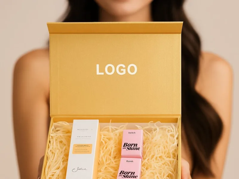
The best return on investment comes from subtle, sophisticated finishes. A targeted accent like a debossed logo, a small touch of metallic foil, or a high-quality matte lamination can transform a simple box into a luxurious item.
![]()
Special finishes, also known as post-press processes, are the details that take a box from good to great. They add texture, shine, and a sense of craftsmanship. You don't need to cover your box in these effects. In luxury packaging, less is more. The key is to use them strategically to highlight the most important part of your brand: your logo. When used with restraint, these finishes add significant perceived value for a relatively small increase in cost.
Subtle Branding That Speaks Volumes
Instead of a standard ink-printed logo, consider a more tactile alternative.
- Debossing: This process presses your logo or design into the paper, creating a subtle indentation. It's an understated and elegant effect that invites touch. It feels custom and high-end.
- Embossing: The opposite of debossing, this process raises your logo from the surface of the paper. It adds dimension and is a classic way to make your brand name stand out.
- Foil Stamping: This technique uses heat and pressure to apply a thin layer of metallic foil (like gold, silver, or rose gold) to the paper. A small, well-placed foiled logo on a matte black or white box is a timeless sign of luxury. It catches the light and draws the eye without being loud.
These techniques focus attention on your brand identity and communicate a level of quality that standard printing cannot match.
Elevating the Entire Box with Lamination
Lamination is a thin plastic film applied to the entire surface of your box after printing. It serves two purposes: it protects the box from scuffs and moisture, and it drastically changes the look and feel.
- Matte Lamination: This is the go-to finish for a modern, luxurious feel. It has a non-reflective, smooth, and almost soft texture. It makes colors appear richer and deeper. A box with matte lamination feels sophisticated and resists fingerprints, maintaining its clean look from the shelf to the customer's home. It provides an excellent contrast for a spot UV or foil stamped element.
- Gloss Lamination: This provides a high-shine, reflective finish. While it can look premium, it is often associated with more mass-market products. For a "Chanel" feel, matte is almost always the superior choice.
Choosing a finish like matte lamination is a simple, cost-effective upgrade that visually and texturally elevates the entire package. It turns a standard paper box into something that feels truly special.
How Can the Unboxing Experience Add Perceived Value?
The customer opens your box and the product is just sitting inside, maybe sliding around. It feels like an afterthought and erodes the premium image you worked hard to create with the exterior.
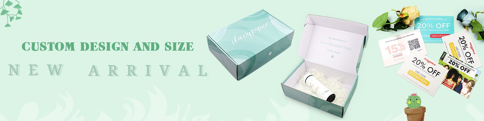
The unboxing experience adds value by making the customer feel like they are revealing a treasure. A sturdy box construction, protective internal fitments or tissue paper, and custom inserts make the process feel deliberate, secure, and luxurious.
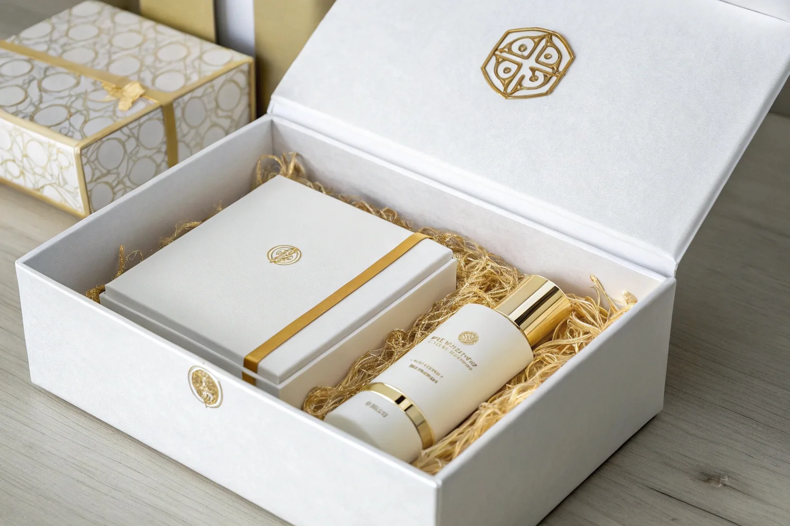
The experience of opening the package is the final step in confirming the customer's purchase decision. A thoughtful unboxing journey makes the customer feel valued and builds excitement for the product inside. It's a sequence of reveals that, when done well, can be as memorable as the product itself. This is where you can add layers of perceived value without significantly increasing your costs per unit.
A Sturdy and Protective Construction
First, the box itself must feel secure. The structure should be rigid, not flimsy. Whether it's a folding carton or a more complex rigid box, it needs to close with a satisfying firmness. This substantial feel communicates that the brand cares about protecting its product. It implies the item inside is valuable and worthy of a strong enclosure. When a customer opens a box that feels solid and well-constructed, it builds anticipation and reinforces the idea that they have purchased a quality item. This is the foundational element of a great unboxing experience.
Layering with Inserts and Tissue Paper
Once the box is open, the reveal should continue. Don't just let the product sit at the bottom.
- Tissue Paper: Wrapping the product in custom-printed or even plain, high-quality tissue paper adds a layer of mystery and care. The crinkle of the paper is a distinct, satisfying sound that adds to the sensory experience. It's an inexpensive addition that feels personal and delicate.
- Internal Fitments: For an even more professional look, use custom inserts. These can be made from folded paperboard or molded foam. An insert holds your product perfectly in place, presenting it beautifully as soon as the box is opened. It communicates precision and attention to detail. This prevents the product from shifting during transit and creates a "nested" look that feels incredibly secure and high-end.
- Custom Sleeves: A paper sleeve that slides over the product or the box itself can add another layer of branding and sophistication. It can carry extra information or simply feature a pattern or embossed logo, adding another step to the reveal process.
These elements work together to slow down the unboxing, turning it from a simple action into a memorable ritual. It's this attention to the journey, not just the destination, that separates standard packaging from a truly luxurious experience.
Conclusion
Creating a "Chanel-like" cosmetic box on a startup budget is entirely possible. Focus on minimalist design, quality materials, subtle finishes, and a memorable unboxing experience to build incredible brand value.