Struggling to make your cosmetic brand stand out? Generic packaging can make your amazing product invisible, leading to missed sales and opportunities to connect with your customers.
Stunning cosmetic box designs inspire purchases by combining protection, aesthetics, and user experience. They use custom inserts, unique finishes, and smart features to tell a brand's story, create a perception of high value, and convince customers to buy.
These details are what separate an average product from a must-have item. As a packaging manufacturer, I've seen firsthand how the right design choices can transform a brand. Let's explore ten key design elements that will influence your next project.
How Do Custom Inserts Protect and Elevate Cosmetic Products?
Does your product rattle inside its box? This movement can cause damage during shipping and looks unprofessional to customers, which harms their perception of your brand's quality.
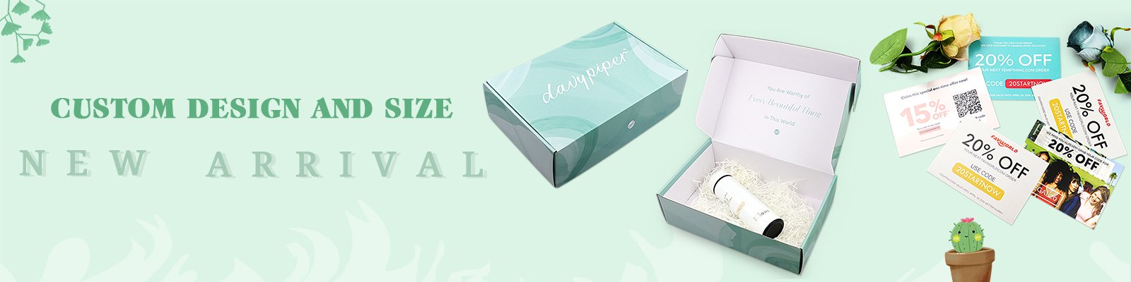
Custom inserts secure products like bottles, jars, and palettes perfectly inside the box. They prevent movement and damage, while also creating a premium unboxing experience that makes your customers feel special.

When we talk about cosmetic packaging, the outside of the box is only half the story. The experience continues when the customer opens it. Custom inserts are not just a protective measure; they are a critical part of a brand's presentation. They cradle the product, presenting it beautifully and securely. We create these inserts from various materials to match the product's needs and the brand's image.
Types of Custom Inserts
There are several options for inserts, and each has its own benefits.
- Paperboard Inserts: These are made from the same material as the box itself. We can print on them to match the box design. They are easily recyclable and cost-effective, making them a popular choice. We design them by creating precise folds and cuts that hold the product snugly.
- Molded Pulp Inserts: This is a very eco-friendly option, often made from recycled paper or bamboo fibers. They have a raw, natural texture that works well for organic or "clean" beauty brands. Molded pulp provides excellent cushioning.
- Foam Inserts (EVA, EPE): For heavy or very fragile items like glass bottles, foam provides superior protection. We can use high-density EVA foam for a luxurious, firm feel or a softer EPE foam for more standard applications. The foam can be cut precisely to any shape and can be covered with a layer of velvet or fabric for an even more high-end touch.
- Thermoformed Plastic Trays (PET, PVC): These clear or colored plastic trays offer a clear view of the product while holding it securely. They are durable, and we can mold them into very specific shapes. Recycled PET (rPET) is a more sustainable option that many of our clients are now choosing.
The table below breaks down the common choices:
| Insert Material | Best For | Key Benefit | Sustainability Level |
|---|---|---|---|
| Paperboard | Palettes, small jars, lightweight items | Cost-effective and printable | High |
| Molded Pulp | Bottles, natural or organic products | Excellent cushioning, eco-friendly | Very High |
| Foam (EVA) | Heavy glass bottles, luxury fragrance | Maximum protection, premium feel | Low |
| Plastic Tray (rPET) | Multi-item kits, products needing visibility | Durable, clear view of product | Medium (if recycled) |
Choosing the right insert is about balancing protection, budget, brand aesthetic, and sustainability goals. It is a detail that shows you care about your product's journey from our factory to your customer's hands.
Why Are Eco-Friendly Materials a Must-Have in Modern Cosmetic Packaging?
Customers are rejecting brands that create excessive waste. Using traditional, non-recyclable materials in your packaging can alienate environmentally conscious buyers and damage your brand's reputation for years to come.
Using sustainable materials like recycled paperboard, biodegradable plastics, and soy-based inks shows customers your brand is responsible. This commitment builds trust and attracts a growing market of eco-conscious consumers.

The shift towards sustainability isn't just a trend; it's a fundamental change in consumer expectations. At my factory, we've received an increasing number of requests for green packaging solutions. Brands understand that their packaging is a direct reflection of their values. If your product contains natural ingredients, the packaging should communicate that same ethos. Using eco-friendly materials is a powerful way to tell your story and connect with your audience on a deeper level. It goes beyond simple compliance; it is a critical part of modern brand identity.
Common Eco-Friendly Material Choices
We guide clients through a variety of sustainable options. The right choice depends on the product, brand message, and desired aesthetic.
- FSC-Certified Paper: The Forest Stewardship Council (FSC) certifies that paper products come from responsibly managed forests. Choosing FSC-certified paperboard ensures you are not contributing to deforestation. This is a baseline standard for any brand serious about sustainability.
- Recycled Cardboard and Paper: Using post-consumer recycled (PCR) content reduces the demand for virgin materials and diverts waste from landfills. We offer various percentages of PCR content. Kraft paper, which is unbleached and often has a natural brown color, is a popular choice for its rustic and eco-friendly look.
- Soy-Based Inks: Traditional inks are petroleum-based and release volatile organic compounds (VOCs) during the printing process. Soy-based inks are derived from a renewable resource, are low in VOCs, and make the paper easier to recycle. The colors are just as vibrant but with a much lower environmental impact.
- Biodegradable Materials: For elements that cannot be made from paper, we explore options like Polylactic Acid (PLA) plastic. PLA is derived from corn starch and is compostable under industrial conditions. It's a great alternative for windows or trays where plastic is necessary.
Communicating Your Green Commitment
Just using the materials is not enough. You have to tell your customers about it.
- On-Package Symbols: Add recognized symbols like the FSC logo or the universal recycling symbol.
- Clear Messaging: A simple line like "This box is made from 80% recycled materials and is fully recyclable" can make a huge difference.
- Design Choices: Minimalist designs often use less ink and fewer coatings, which can also be an eco-friendly choice. Letting the natural texture of recycled paper show through can be a powerful design statement in itself.
Ultimately, sustainable packaging respects both the planet and your customer. It shows that you’ve thought about the entire lifecycle of your product, not just the moment of sale.
What Finishing Touches Make Cosmetic Packaging Feel Luxurious?
Your cosmetic product is high-quality, but the box looks and feels plain. This disconnect confuses customers. A basic box can cheapen a premium product, making customers second-guess the price tag.
Specialized finishing techniques like hot foil stamping, embossing, and spot UV create visual and tactile appeal. These details signal quality and craftsmanship, justifying a higher price point and creating a memorable experience.

Luxury is an experience, and it starts with the packaging. When a customer picks up a box, the way it feels in their hands is just as important as the way it looks. At our factory, we use a range of finishing techniques to add depth, texture, and a touch of elegance. These are not just decorative elements; they are strategic tools used to communicate the premium nature of the product inside. A simple logo can transform into a statement piece with the right finish. It’s these small, deliberate details that elevate a package from a simple container to a keepsake.
A Closer Look at Premium Finishes
Each finishing technique offers a unique effect. We often combine them to create a truly custom and sophisticated design.
- Hot Foil Stamping: This process uses heat and pressure to apply a metallic or pigmented foil to the paper. Gold, silver, and rose gold are classic choices for a luxe feel. But we can also use holographic foils for a modern, eye-catching effect or matte foils for a more understated elegance. It adds a brilliant shine that ink simply cannot replicate.
- Embossing & Debossing: Embossing raises a pattern or text from the surface of the paper, while debossing presses it down. Both create a three-dimensional, tactile effect that invites touch. An embossed logo feels substantial and important. A debossed pattern adds subtle texture and sophistication.
- Spot UV: Spot UV involves applying a high-gloss ultraviolet (UV) coating to a specific area of the design. This creates a striking contrast against a matte background. For example, we might apply Spot UV to the product name or a specific pattern, making it pop off the box with a wet, shiny look.
- Soft-Touch Lamination: This finish gives the entire box a velvety, smooth texture that feels incredibly luxurious and almost suede-like. It provides a matte appearance while protecting the box from fingerprints and scuffs. It makes holding the package a pleasant tactile experience.
Here is how these finishes can be used:
| Technique | Best For | Effect | Brand Message |
|---|---|---|---|
| Hot Foil Stamping | Logos, brand names, borders | Metallic shine, high-end reflection | Opulence, Glamour |
| Embossing/Debossing | Logos, monograms, patterns | 3D texture, subtle depth | Craftsmanship, Heritage |
| Spot UV | Highlighting specific elements, patterns | High gloss vs. matte contrast | Modern, Sleek, Bold |
| Soft-Touch Finish | The entire box surface | Matte, velvety feel | Understated Luxury, Comfort |
By thoughtfully applying these finishes, we help brands create packaging that not only looks expensive but feels it too. This tactile confirmation of quality plays a huge role in a customer’s purchasing decision and their lasting impression of your brand.
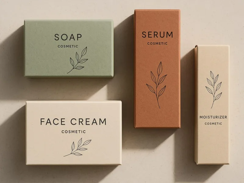
Is Minimalism the Key to Sophisticated Cosmetic Branding?
Are you overwhelming customers with loud colors and cluttered designs? Too much information on your packaging can look cheap and confusing, failing to communicate the quality and effectiveness of your product.
Yes, minimalist designs with clean lines, controlled color palettes, and elegant typography often define high-end cosmetic brands. This approach conveys confidence, sophistication, and a focus on the quality of the product itself.

Minimalism in packaging design is not about being empty; it's about being intentional. It’s the design philosophy that less is more. For luxury and premium cosmetic brands, a minimalist approach works because it shifts the focus from the packaging to the product. It suggests that the product is so good, it doesn't need a loud, flashy box to sell itself. As a manufacturer, I've seen how this "quiet confidence" translates into perceived value. A clean, well-executed design uses white space strategically. This space gives the important elements, like your brand name and the product type, room to breathe. The result is a look that feels calm, modern, and trustworthy.
The Core Elements of Minimalist Design
Achieving a sophisticated minimalist look requires careful attention to three key areas.
1. Color Palette
Minimalist design typically relies on a very limited color scheme.
- Monochromatic: Using different shades and tints of a single color. A black box with grey text is a classic example.
- Achromatic: Using only black, white, and shades of grey. This is the most common approach and creates a timeless, elegant look.
- Subtle Accent: Using a neutral base (like white or beige) with a single, small pop of color to draw attention or represent a key ingredient.
2. Typography
With fewer graphic elements, the font choice becomes incredibly important. The typography has to carry the brand's personality.
- Serif Fonts: These fonts have small "feet" on the letters (like Times New Roman). They often convey a sense of tradition, reliability, and elegance.
- Sans-Serif Fonts: These fonts lack the "feet" (like Arial or Helvetica). They create a clean, modern, and straightforward feel. High-end brands often use custom sans-serif fonts that are thin and widely spaced for a light, airy look.
3. Layout and White Space
The arrangement of elements is crucial. A minimalist layout is uncluttered and balanced.
- Use of Grid: We align all text and logos to a strict grid. This creates an underlying sense of order and calm.
- Generous Margins: We leave plenty of empty space around the logo and text. This white space is an active design element that prevents the box from feeling crowded and helps the viewer focus on what's important.
Minimalism isn't the right choice for every brand. A brand aimed at a younger, more playful audience might benefit from bold colors and patterns. But for brands that want to communicate sophistication, purity, and excellence, minimalism is a powerful and proven strategy.
How Can Die-Cut Windows Boost Customer Trust and Sales?
Customers are naturally hesitant to buy a cosmetic product they can't see. Hiding your product behind solid cardboard can create doubt and lead them to choose a competitor's product instead.
Die-cut windows and transparent elements let customers see the actual product inside the box. This transparency builds trust, showcases the color and quality of the item, and can significantly increase sales.

In the world of cosmetics, color and texture are everything. A customer wants to see the exact shade of lipstick or the shimmer in an eyeshadow palette before they buy. A die-cut window serves as a sneak peek, bridging the gap between the beautiful packaging and the product they are actually purchasing. It removes guesswork and builds instant confidence. From a manufacturing perspective, creating a window is a precise process. We use a die, which is like a custom cookie-cutter, to cut a specific shape out of the paperboard. This opening is then typically covered with a thin, clear film (often PET or the more eco-friendly PLA) to protect the product while keeping it visible. The shape of the window itself can be a branding element—it can be a simple circle or square, or it can be shaped like the brand's logo or the product itself.
Strategic Uses for Die-Cut Windows
Die-cut windows are not just for showing off color. They can be used in several smart ways to enhance the packaging.
- Color Matching: This is the most common use. For products like foundation, blush, or lipstick, showing the true shade is essential. It reduces surprise and customer dissatisfaction later.
- Showcasing Texture: For products like a glittery highlighter or a marbled bronzer, a window allows the unique texture and finish of the product to shine through.
- Highlighting a Unique Component: If your product has a special applicator, a unique jar, or a beautiful cap, a window can be used to frame that specific feature, turning it into a selling point.
- Creating Interactive Designs: The window can be part of a larger graphic. For example, a box for an eye cream could have a window shaped like an eye, with the jar of cream positioned as the iris. This creates a playful and memorable design.
Important Considerations
When designing a box with a window, there are a few things to keep in mind.
| Consideration | Description | My Recommendation |
|---|---|---|
| Structural Integrity | Cutting a hole in the box can weaken it. The design must ensure the box remains strong. | We reinforce the area around the window and advise on the maximum safe size for a given box style. |
| Film Material | The clear film must be high-quality, scratch-resistant, and securely glued to the box. | I recommend a sturdy 0.2mm PET or PLA film and use strong, clear adhesive for a seamless finish. |
| Product Placement | The product must be held securely in place so that the desired part is always visible through the window. | This is where a custom insert is crucial. It ensures the product is perfectly aligned every time. |
A well-designed window is an invitation. It tells the customer, "We have a beautiful product, and we're proud to show it to you." This transparency is a simple but incredibly powerful tool for building trust and driving sales.
Conclusion
Great design sells. These ten ideas—from inserts to interactive elements—are not just trends; they are tools to build your brand and connect with customers.